Sudden big change in Google phone app: For the last few days, Android users were suddenly shocked when they saw that the dialer interface of their phone changed automatically. The most surprising thing was that this change happened neither due to any app update nor due to any new permission. As soon as the phone reconnected to the internet, people found that their phone app had changed to a new design. This unwanted surprise gave rise to both anger and debate on social media.
New look of the call log and home tab
Google has changed the entire layout of its phone app. Earlier, where all the calls of the same number were visible together in the call log, now every call appears as a separate entry. Also, now call history and favorite contacts have been combined in the same home tab instead of keeping them in separate tabs.
In the new design, calls appear in cards with rounded edges, which makes the look of the app look more modern and clean. Apart from this, a new filter system has also been added, through which users can easily see missed calls, spam calls or saved contacts separately.
New way to receive calls
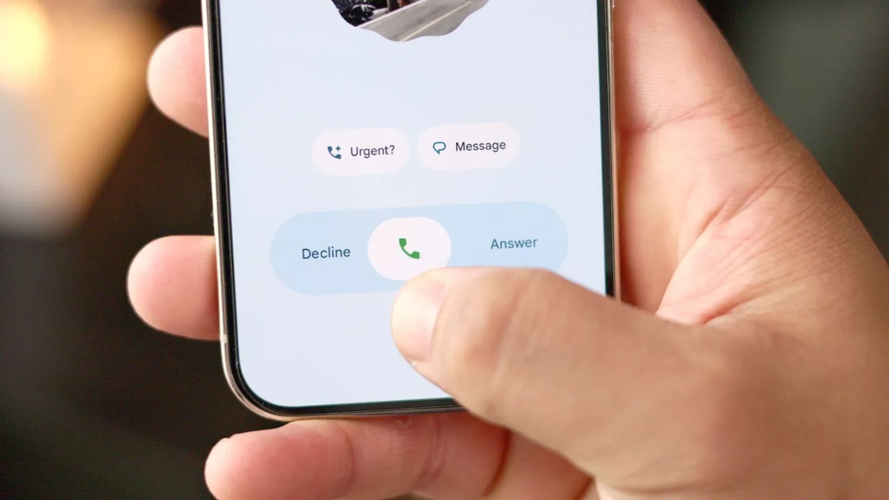
The biggest change was seen on the in-call screen. Where earlier there were small icons to receive and cut calls, now they have been replaced by large round and rectangular buttons. Apart from this, a new gesture system has also been added, in which users will only have to swipe or tap to pick up or disconnect the call. That is, now there are two different options to receive calls.
Mixed reactions from users
The way this change was implemented has created the most controversy. Google has implemented it through server-side activation, that is, the new interface started appearing on every user’s phone without updating the app.
Many users expressed their displeasure on platforms like Reddit and X (Twitter). They say that this new design is unnecessary and confusing. At the same time, some users also praised it and said that the new interface looks cleaner, more attractive and modern than before.
Google’s side
Amid criticism from users, Google justified this change. The company says that this design is based on user research. Google studied more than 18,000 people and found that Material 3 Expressive Design helps people recognize important buttons and information faster than before.
Google also made it clear that the Phone app is only the first step. In the coming time, this design will also be implemented in other apps like Messages, Contacts, Gmail and Photos. That is, this change is part of Google’s entire design philosophy.
How to get the new interface
If you have version 186 of the Google Phone app, then this new interface can be activated on your phone. By going into the app settings, you can change Gestures and Navigation as per your convenience. However, no option has been given to return to the old design yet. This is the reason why many users are angry with this unilateral change.
Change or compulsion?
It is clear that Google has tried to make its user interface more modern and unified through this update. But the way this change was implemented suddenly made many users uncomfortable.
For some people, this is a step towards the future, while for others it is a compulsion to break the habit. Whether it is liked or disliked, it is certain that Google’s phone app will no longer be the same as before.